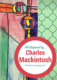
There are lot's of places that I could improve my curriculum and one of those places is with art history. I fight a little internal battle when thinking about Art History. Who do you cover? I have the kids 28 hours in a year, so in that amount of time do you cover Art that will be recognizable? Art that is modern, or ancient? Do you cover American or Global Artist and how do you celebrate Art History? Do you recreate, lecture, or simply share?? It might be the next Monster Medium or #ProcessPigs series. OK... deep thought done for today, let me share the latest artwork concentrating on direction of line but also inspired by Charles Mackintosh, a Scotish Artist.
So maybe this is part of my reservations with covering an Artist... I'm not sure if I'm 100% accurate... I did my research and I paid attention in Art History Class (most of the time), but I need to cover this artist in terms that a first grader can understand. So here is my attempt on Charles Mackintosh.
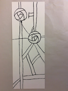
I tried to break down the steps of this rose for my students. This was actually more successful that I expected with my 1st graders. I have even had kids use this rose outside of class. I love when kids take what they learned in class, and they recreate it in a new way... That's the goal, right?
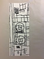
Sure, this is a canned lesson. When teaching this, one might think that they would all turn out the same. I guess, to a certain extent they do, but I was really excited when I started seeing some of the compositions coming from these 6 and 7 year-old artist. The MAIN concept here was direction of lines; vertical, horizontal and diagonal. They rocked it... accidently for the most part. But that's why I love kids art work, it's rarely over-thought.
Class two, they did a little coloring with crayons and watercolors. Again, I would not have chosen the direction many of the kids took with their colors, but WOW! They turned out stunning.
For this lesson, I had them finish up with a little assessment to assure they had the direction of lines understood. The assessment was placed on the back of their artwork to communicate the goals of the lesson to parents. I also asked these kids to mount their work by themselves. Again, that went better than I thought and it taught them the concept of finishing a work for display.


What grades did you do this with?
ReplyDeleteI did this with 1st grade.
DeleteVery very nice! Thank you for sharing!
ReplyDeleteI think this is an excellent class for 1st graders! Good job!
ReplyDeleteGreat video(s) and lesson.
ReplyDelete